Colour Psychology in Art: How I Use Colours to Evoke Emotion
As an artist, I see colour as one of the most powerful tools for expression and connection. Each hue carries an emotional weight, influencing how we perceive art and the feelings it evokes. My work explores the psychology of colour, using it to express movement, emotion, and energy in a way that speaks to the soul. Whether you’re an artist, an art collector, or simply an admirer of creativity, understanding the psychology behind colours can deepen your connection to a piece and further deepen your connection to self.
How Colours Speak in Art
Understanding color theory in fine art is essential for creating emotional impact and meaningful compositions. Colours are not just visual elements; they are powerful tools that evoke feelings, set moods, and establish connections between the artwork and the viewer. In my paintings, I carefully select colours to communicate a certain feeling or energy, whilst also balancing the charcoal composition and negative space. Here’s how I use colour psychology in my original works with reference to my hand-embellished limited edition prints:
1. Red – Passion, Energy, and Power
Red demands attention. It’s the color of intense emotions—love, desire, and even anger. I use red quite rarely to create movement and boldness in my work, adding a sense of urgency or deep emotional pull. When balanced with softer colours like peach, cream or pastel turquoise, red becomes even more striking, forming a contrast that heightens its intensity.
Feel the intensity of red in my artwork: “Red Wine Weekend” – Hand-Embellished Limited Edition Print
2. Blue – Calmness, Serenity, and Depth
Blue has an incredible ability to soothe and ground us. Lighter blues bring a peaceful openness and calming vibrancy, while deeper blues create alluring depth and mystery. I often use blue to balance fiery tones, cooling down compositions and giving the viewer a sense of clarity and peace. The way blue interacts with other colours in my work creates a sense of cool motion, much like looking at a lake, an ocean or an open sky.
Discover the serenity of blue: “Butterfly Ballerina” – Hand-Embellished Limited Edition Print
3. Yellow – Happiness, Optimism, and Energy
Yellow is pure joy. It radiates warmth, creativity, and excitement. I love incorporating yellow to infuse my work with a sense of optimism and playfulness. When used alongside deeper hues, yellow becomes a beacon of light, creating a glowing effect that draws the eye and lifts the mood. I often use yellow as the final pop of colour in my multicolour paintings. Yellow is often the star colour of my work.
Bring sunshine into your space with yellow: “Daisy Dance” – Open Edition Print
4. Green – Growth, Nature, and Harmony
Green represents renewal and balance. It reminds us of nature and the fresh energy of life. I use green to express harmony, allowing the viewer to feel a connection with the natural world. When paired with earthy tones, green evokes stability, while brighter greens add a fresh, uplifting vibrancy. It’s considered as one of the most difficult colors to sell in art. However, I am never shy of using this favourite colour of mine.
Experience the calm of green: “Flower Garden Dancer” – Hand-Embellished Limited Edition Print
5. Black – Mystery, Elegance, and Power
Black is bold and sophisticated, often symbolising strength and mystery. It adds contrast and drama, creating a powerful focal point in an artwork. With all that said, I never use “true black” as such. Rather, I use charcoal black. I use charcoal black to ground compositions, drawing the viewer into the main purpose or realistic focus of the paintings. The balance of black with lighter to white tones gives a timeless focus to the subject and also a dynamic energy balance to the piece.
Explore the elegance of black: “Honey Bee Woman” – Hand-Embellished Limited Edition Print
6. White – Purity, Simplicity, and Peace
White represents openness and clarity. It provides space for reflection and calm, which is partly why I use it to balance and enhance other colours in my work. The other reason for the blank white canvas is to link to my philosophies on existence. Such, I’ll explain in a later blog post. White acts as a space to breathe, helping more vibrant hues to stand out while maintaining a sense of softness and tranquility.
Find simplicity and peace in white: “Snow Lake Ballerina” – Open Edition Print
7. Purple – Creativity, Royalty, and Spirituality
Purple is a colour of imagination and dreamlike wonder. It conveys a sense of luxury, depth, and artistic expression. I love using it to enhance the surreal aspects of my pieces. When paired with blues and pinks, purple creates a soft, mysterious flow, evoking a sense of creativity and inner exploration.
Immerse yourself in the magic of purple: “Garden Dreams” – Hand-Embellished Limited Edition Print
8. Pink – Love, Compassion, and Playfulness
Pink has a softness that feels inviting and full of life. Whether delicate and romantic or vibrant and playful, pink adds warmth and character to my paintings. I often use pink to bring a sense of fluidity and grace to my compositions, creating a visual rhythm that evokes a feeling of comfort and joy. I occasionally use pink to spice up a calm colour mix and provide a new level of innocence and joy.
Embrace the beauty of pink in art: “French Flower Dancer” – Hand-Embellished Limited Edition Print
9. Orange – Warmth, Enthusiasm, and Creativity
Orange is a color full of vitality and excitement. It carries the energy of red but with a friendly, approachable warmth. I use orange to create a sense of enthusiasm and movement, often blending it with yellows and reds to intensify its impact. Orange also has a way of bringing balance—it can be both bold and inviting, making it a perfect choice for adding vibrancy without overwhelming a composition.
Feel the warmth of orange in art: “Wings Of The Wanderer” – Hand-Embellished Limited Edition Print
10. Gold – Luxury, Success, and Enlightenment
Gold brings a sense of grandeur and timeless beauty. I use gold elements in my work to symbolise success, enlightenment, and the brilliance of life. When applied with textured layering, gold catches the light and adds a sense of movement, making each artwork feel alive with energy and radiance. I find gold to be the perfect companion for charcoal and often use it within the charcoal sections itself.
Add a touch of luxury to your space: “Lunar Lion” – Hand-Embellished Limited Edition Print
Final Thoughts
For me, colour isn’t just about aesthetics—it’s about emotion, energy, and storytelling. Every shade I use has a purpose, guiding the viewer through a journey of feeling and movement. Whether you’re drawn to the deep mystery of deep universe blue, the passion of vibrant lipstick red, or the joyful radiance of yellow, colours have a way of speaking to us all. Colour Psychology is fascinating and also continues to be inspiring.
Discover my latest fine art original paintings analysing the colour psychology!
If you’ve connected with the emotion of a particular colour in my work, also explore my latest hand-embellished limited edition prints and find the perfect piece that speaks to you. Browse my collection here.Next time you look at a painting, take a moment to notice how its colours make you feel—you might just uncover a new layer of meaning and a new layer of you.
Take care,
Ashvin Harrison
Ashvin Harrison
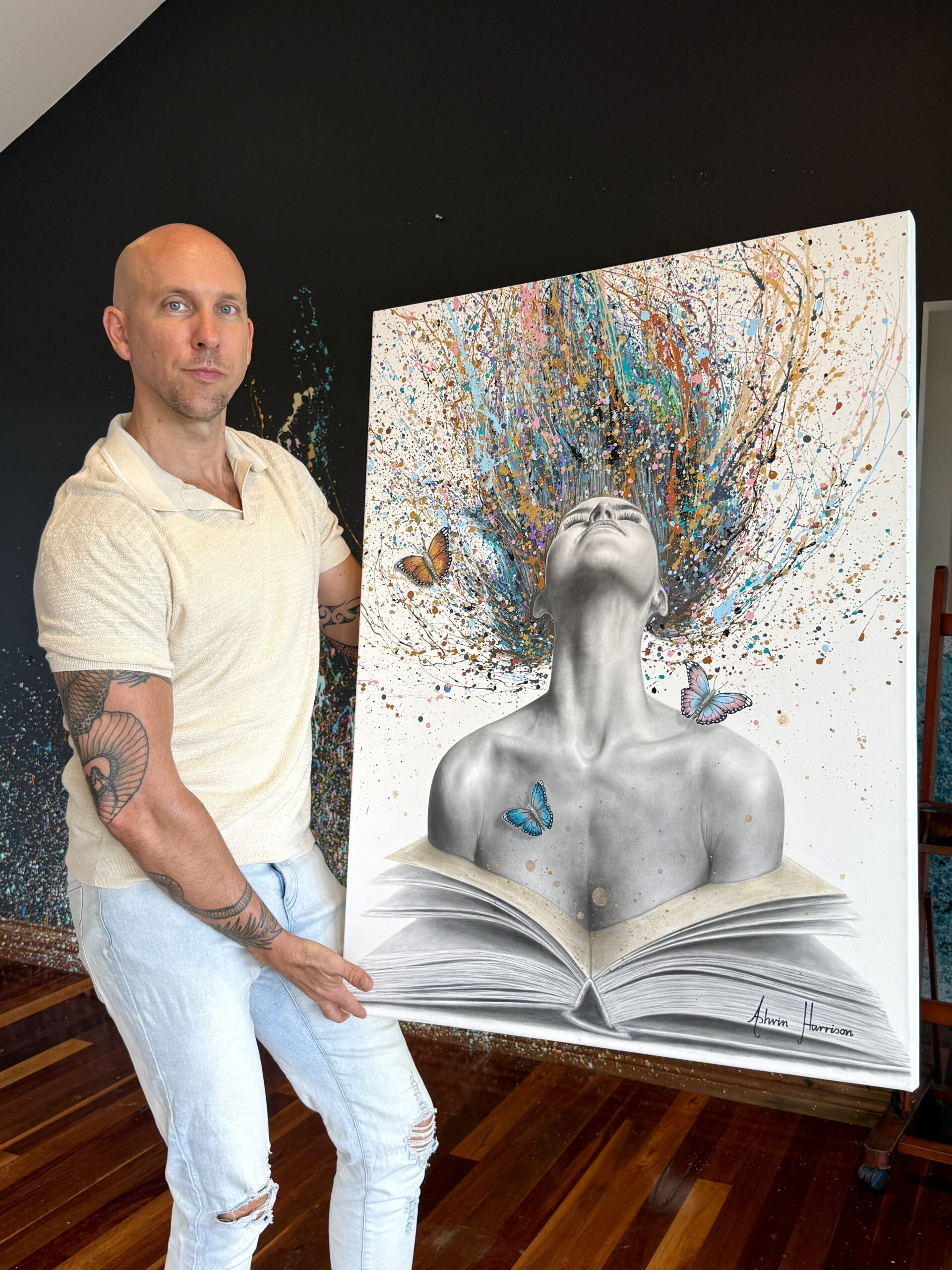
Ashvin Harrison is an Internationally acclaimed Australian artist living in the Sunshine Coast, Australia. His unique expressive creations of charcoal and paint examine the human condition through philosophical and emotional inspirations. Ashvin is a self taught artist whom has created and sold artworks in over 50 countries since becoming a full-time artist in 2017. Ashvin Created this unique genre style, referred to as 'Motusrealism', in 2012.