The Top Ten Acrylic Paints For Artists
Acrylic paint is one of the most versatile mediums in the world, but here’s the truth most artists only figure out after actually using them properly:
Not all acrylic paints behave the same once you start pushing them.
Most brands look good in a tube.
Most brands look fine on a palette.
But when you start to:
- splatter
- blend aggressively
- use mediums
- build movement and texture
That’s where the real differences show.
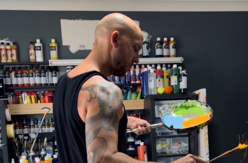
My style sits in abstract expressionism, with a focus on movement, contrast, and controlled chaos. I don’t just paint neatly — I push the paint to react, flow, and create energy on the canvas. So the way a paint behaves matters more than how it looks straight out of the tube.
Over the years, I’ve tested most of the major acrylic brands in real studio conditions, not just basic painting, but high-energy work where flow, vibrancy, and reaction are critical.
Here’s my honest breakdown of the main acrylic paint brands and how they actually perform.
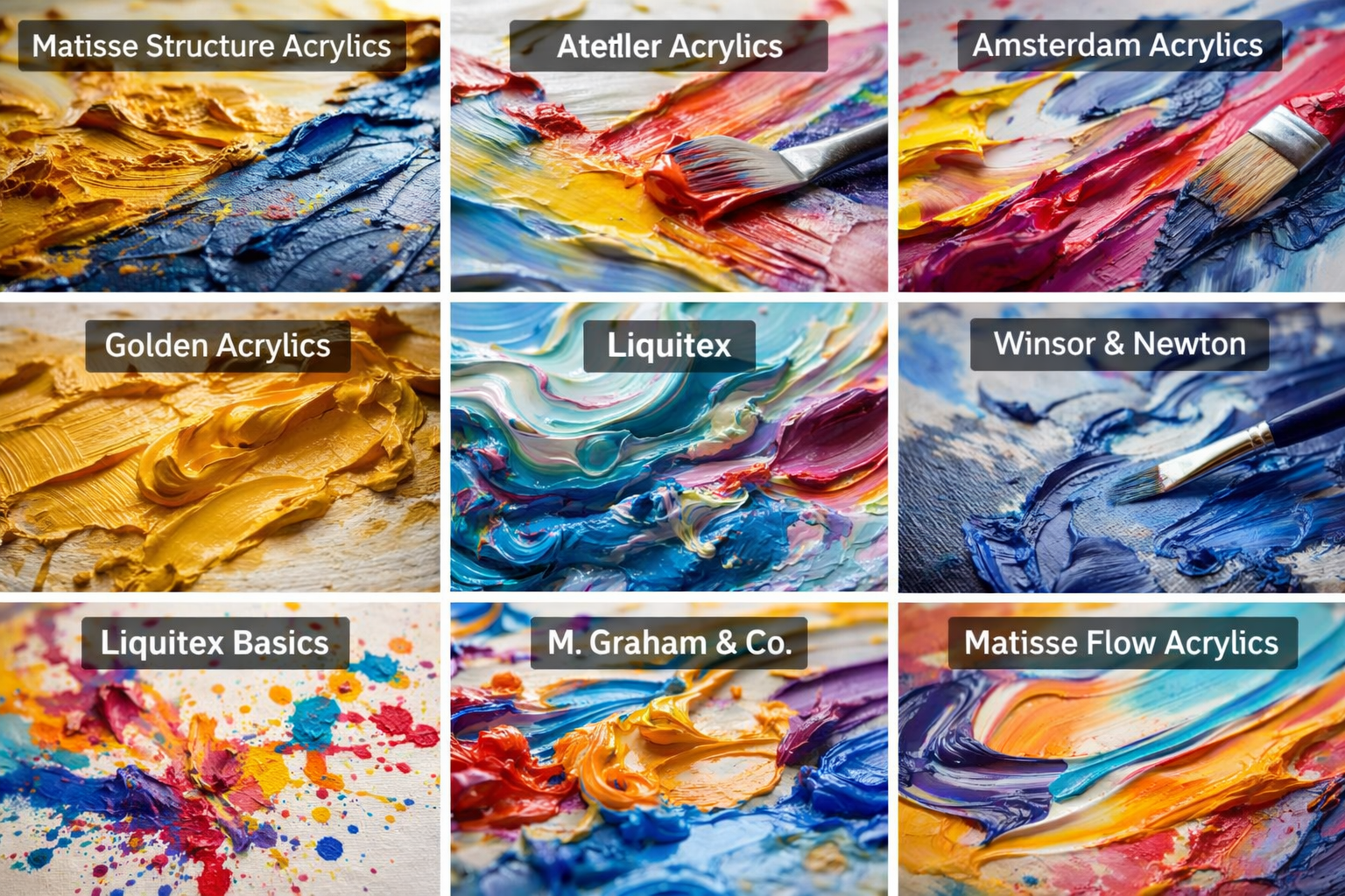
- Matisse Structure Acrylics
This is the one I use the most.
Matisse Structure paints have a really strong pigment load and hold their colour incredibly well, even when you start mixing or pushing them around. The colours feel bold, clean, and confident on the canvas.
They’re not designed for flow, but that’s not what they’re for.
Where they shine is:
- strong colour impact
- thick, controlled application
- high pigment strength
For my work, I use this as the backbone. It gives me the solid, powerful colour base that everything else builds off.
- Atelier Acrylics
Atelier is one of the most underrated paints in my opinion.
They behave differently to most acrylics because they stay workable for longer, which gives you more control when blending and moving paint around.
Where they stand out:
- longer working time
- smooth blending
- very consistent performance
I use Atelier flow paints a lot, especially in larger works where I want control and consistency across the canvas.
- Amsterdam Acrylics
Amsterdam has grown on me a lot over time.
They’re very reliable, easy to blend, and the colours are bright without feeling cheap or flat.
Where they shine:
- vibrant colour
- easy blending
- very versatile with mediums
When mixed properly with mediums, these can become incredibly expressive and fluid.
- Golden Acrylics
Golden is a premium paint, and you can feel it immediately.
The pigment is rich, deep, and has a certain weight to it that stands out, especially in colours like ochre. It almost has a slight oil-like quality in the finish.
Where it shines:
- incredible colour depth
- high pigment load
- beautiful finish
Where it’s limited for my style:
- not great for splatter or flow
- feels heavier and more controlled
I use Golden when I want richness and depth, not movement.
- Liquitex
Liquitex is one of the most flexible brands out there.
It’s smooth, easy to use, and works really well with mediums, which makes it perfect for expressive work.
Where it shines:
- great flow and movement
- easy blending
- consistent performance
The colours aren’t quite as rich as Golden, but they’re still strong and very usable.
This is one of my go-to paints when I want energy and splatter.
- Winsor & Newton
Winsor & Newton is a classic, and it does exactly what it’s supposed to do.
It’s clean, controlled, and very reliable.
Where it shines:
- smooth application
- good lightfastness
- consistent results
Where it doesn’t suit my work:
- doesn’t flow well
- feels a bit restricted for expressive techniques
I don’t use much of it personally, but for traditional painting, it’s excellent.
- Liquitex Basics
This one surprises a lot of people.
Even though it’s a student-grade paint, I use it quite a bit, especially for splatter work.
Why?
Because it’s:
- affordable
- easy to control
- great with mediums
Where it shines:
- expressive techniques
- large-scale work without wasting expensive paint
Where it falls short:
- lower pigment strength
But for what I use it for, it’s actually perfect.
- M. Graham & Co.
M. Graham paints are interesting because they use honey in their formula, which gives them a very smooth, slightly different feel.
Where they shine:
- smooth consistency
- easy blending
- unique texture
They’re not something I use heavily, but they’re definitely high quality and worth exploring depending on your style.
- Matisse Flow Acrylics
This is where Matisse becomes much more fluid and expressive.
These are designed for movement.
Where they shine:
- smooth flow
- easy blending
- clean, bright colour
Where they fall short:
- not good for thick application
I use these for highlights, splatter, and controlled movement when I want the paint to move easily.
- Daler Rowney
Daler Rowney is more on the affordable side, but still very usable.
It doesn’t have the same pigment strength as higher-end brands, but it holds up well depending on what you’re doing.
Where it shines:
- affordable
- decent colour strength
- good for thicker application
Where it falls short:
- less depth in colour
I don’t use it much personally, but it’s a solid option for artists building their setup.
Final thoughts
There isn’t one “best” acrylic paint.
There’s only what works for how you paint.
For me, everything comes down to:
- movement
- reaction
- colour strength
- and how the paint behaves under pressure
That’s why I mix brands, combine mediums, and use different paints for different parts of the same artwork.
If you’re serious about improving your work, don’t just stick to one brand.
Test them. Push them. Break the rules a bit.
That’s where the real results start to happen.
If you want to see how I actually use these paints in my work, you can explore my latest pieces here:
View The Originals
Ashvin Harrison
Ashvin Harrison is an Internationally acclaimed Australian artist living in the Sunshine Coast, Australia. His unique expressive creations of charcoal and paint examine the human condition through philosophical and emotional inspirations. Ashvin is a self taught artist whom has created and sold artworks in over 50 countries since becoming a full-time artist in 2017. Ashvin Created this unique genre style, referred to as 'Motusrealism', in 2012.